• Graphics
  • Figma
  • Research
  • Newsletter
  • About
  • Contact

Zhenia Vasiliev

  • Graphics
  • Figma
  • Research
  • Newsletter
  • About
  • Contact

Drawing based on field recordings

Gather field sound material and then use it as a basis for drawings.Pick some different types of fields, as: - Repetitive background noise, like a train passing by - Sporadic clustered noise, such as people walking across schoolyard / park with dogs - Sounds of tv program/ talk show in unknown language - Various types of silence: with different emortional charge (awkward silence, silence before the storm, concentrated silence between two loud noises, eternal silence of outer space, etc.) - Sounds from the inside spaces: big/small rooms, bars, cafes, library, in public transport, inside own home, train station, church, theater, hairdresser, hospital, lavatory, bathroom - Sounds of nature vs man-made: wind, car sounds, church bells, bird songs, dog bark, rain, thunder - Sounds based on objects found in the field: knock on wood, rotating / breaking the glass, pouring/ boiling the water, clicking on switches, echo of different places, hand dryer, crumpling plastic bag.
 

tags: drawing, field
categories: reference
Monday 08.11.14
Posted by Zhenia Vasiliev
 

Vignelli canon: use of fonts

In the new computer age, the proliferation of typefaces and type manipulations represents a new level of visual pollution threatening our culture. Out of thousands of typefaces, all we need are a few basic ones, and trash the rest. The Vignelli Canon, p. 56

tags: design, font, urbino
categories: reference
Thursday 07.17.14
Posted by Zhenia Vasiliev
 

Space as material

In phenomenology, the environment is concretely defined as "the place", and the things which occur there "take place". The place is not so simple as the locality, but consists of concrete things which have material substance, shape, texture, and color, and together coalesce to form the environment's character, or atmosphere. It is this atmosphere which allows certain spaces, with similar or even identical functions, to embody very different properties, in accord with the unique cultural and environmental conditions of the place which they exist. Phenomenology is conceived as a "return to things", maneuvering away from the abstractions of science and its neutral objectivity. Phenomenology absorbs the concept of subjectivity, making the thing and its unique conversations with its place the relevant topic and not the thing itself. The man-made components of the environment become the settlements of differing scales, some large—like cities, and some small—like the house. The paths between these settlements and the various elements which create the cultural environment become the secondary defining characteristics of the place. The distinction of natural and man-made offers us the first step in the phenomenological approach. The second is to qualify inside and outside, or the relationship of earth-sky. The third and final step is to assess character, or how things are made and exist as participants in their environment. Source: http://en.m.wikipedia.org/wiki/Phenomenology_(architecture)

tags: design, drawing, notes, phenomenology, space, urbino
categories: reference
Tuesday 07.15.14
Posted by Zhenia Vasiliev
 

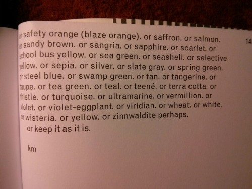
Which colours are Karel Martens' boxes?

  1. Alice blue
  2. alizarin crimson
  3. amber
  4. amethyst
  5. aqua
  6. acquarnarine
  7. asparagus
  8. azure
  9. beige
  10. bistre
  11. black
  12. blue
  13. Bondi blue
  14. brass
  15. bright green
  16. bright turquoise
  17. bright violet
  18. bronze
  19. brown
  20. buff
  21. burgundy
  22. burnt orange
  23. burnt sienna
  24. burnt umber
  25. camouflage green
  26. cardinal
  27. carmine
  28. carrot
  29. celadon
  30. cerise
  31. cerulean
  32. cerulean blue
  33. chartreuse
  34. chestnut
  35. chocolate
  36. cinnamon
  37. cobalt
  38. copper
  39. coral
  40. corn
  41. cornflower blue
  42. cream
  43. crimson
  44. cyan
  45. dark blue
  46. dark brown
  47. dark cerulean
  48. dark chestnut
  49. dark coral
  50. dark goldenrod
  51. dark green
  52. dark indigo
  53. dark khaki
  54. dark olive
  55. dark pastel green
  56. dark peach
  57. dark pink
  58. dark salmon
  59. dark scarlet
  60. dark slate gray
  61. dark spring green
  62. dark tan
  63. dark tangerine
  64. dark tea green
  65. dark terra cotta
  66. dark turquoise
  67. dark violet
  68. denim
  69. dodger blue
  70. eggplant
  71. emerald
  72. fern green
  73. flax
  74. fuchsia
  75. gamboge
  76. gold
  77. goldenrod
  78. gray
  79. gray-asparagus
  80. gray-tea green
  81. green
  82. green-yellow
  83. heliotrope
  84. hot pink
  85. indigo
  86. international Klein blue
  87. international orange
  88. jade
  89. khaki
  90. khaki (X11)
  91. lavender
  92. lavender blush
  93. lemon
  94. lemon cream
  95. light brown
  96. lilac
  97. lime
  98. linen
  99. magenta
  100. malachite
  101. maroon
  102. mauve
  103. midnight blue
  104. mint green
  105. moss green
  106. Mountbatten pink
  107. mustard
  108. Navajo white
  109. navy blue
  110. ochre
  111. old gold
  112. olive drab
  113. orange
  114. orchid
  115. pale blue
  116. pale brown
  117. pale carmine
  118. Pale chestnut
  119. pale cornflower blue
  120. pale magena
  121. pale pink
  122. pale red-violet
  123. pale sandy brown
  124. papaya whip
  125. pastel green
  126. pastel pink
  127. Paul mauve
  128. peach
  129. peach-orange
  130. peach-yellow
  131. pear
  132. Persian blue
  133. pine green
  134. pink
  135. pink-orange
  136. plum
  137. powder blue
  138. Prussian blue
  139. puce
  140. pumpkin
  141. purple
  142. raw umber
  143. red
  144. red-violet
  145. robin egg blue
  146. royal blue
  147. russet
  148. rust
  149. safety orange (blaze orange)
  150. saffron
  151. salmon
  152. sandy brown
  153. sangria
  154. sapphire
  155. scarlet
  156. school  bus yellow
  157. sea green
  158. seashell
  159. selective yellow
  160. sepia
  161. silver
  162. slate gray
  163. spring green
  164. steel blue
  165. swamp green
  166. tan
  167. tangerine
  168. taupe
  169. tea green
  170. teal
  171. teené
  172. terra cotta
  173. thistle
  174. turquoise
  175. ultramarine
  176. vermillion
  177. violet
  178. violet-eggplant
  179. viridian
  180. wheat
  181. white
  182. wisteria
  183. yellow
  184. zinnwaldite

Text source: Full color, Martens, Schwartz. Roma Publications, 2013. P. 143-145

wpid-img_20140714_221943.jpg wpid-img_20140714_222907.jpg

tags: colours, design, name
categories: reference
Monday 07.14.14
Posted by Zhenia Vasiliev
 

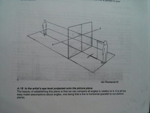
Analysis drawings from the Slade drawing course, Autumn 2012

image

image

image

Artwork courtesy Ian Rowlands

categories: reference
Sunday 07.13.14
Posted by Zhenia Vasiliev
 

The Noun project - a website about icons

A great website with lots of superb iconography - an extermely useful instrument when working on own icons - and for buying icons from designers, too, of course: noun_project_screenshot

tags: design, iconography, icons
categories: reference
Thursday 07.03.14
Posted by Zhenia Vasiliev
 

1968 Mexico Olympic Games pictocharts

pictocharts for 1968 Mexico Olympic GamesPictocharts for 1968 Mexico Olympic Games, by Lance Wyman (US) Image source: http://www.tapook.com/2012/07/olympic-pictograms/
tags: iconography, illustration
categories: reference
Tuesday 07.01.14
Posted by Zhenia Vasiliev
Comments: 1
 

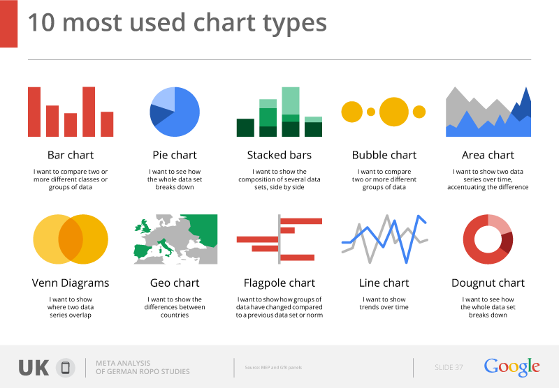
Ten most used chart types

(from Digital Agency to Google) 10_most_used_charts

tags: charts, design, digital agency, graphics, infographics
categories: reference, research notes
Thursday 06.26.14
Posted by Zhenia Vasiliev
 

Here's the praise to Calibri

Source: http://www.myfonts.com/fonts/ascender/calibri/ Calibri has been behaving badly, tell us presentation specialists at Slidebean: 'Calibri is one of the ugliest fonts ever invented by mankind, I hold it up there with other design fails such the infamous Comic Sans MS'.

Ouch. After reading an introduction like this the only fonts I want to use now are by all means only Comic Sans and Calibri! I'm even ready to forget my beloved Arial and Times New Roman for a while. (:

Image source: http://www.myfonts.com/fonts/ascender/calibri/

tags: font, typography
categories: reference, research notes
Tuesday 06.24.14
Posted by Zhenia Vasiliev
 

Polar chart generator

Let our lives be changed forever! The interactive chart builder that we've been dreaming of for so long has finally been created by the genius of Matt Bentley (and it also exports results into svg's!). chart


Access it now!

tags: data visualization, development, highcharts, infographic, interactive
categories: reference
Friday 06.13.14
Posted by Zhenia Vasiliev
Comments: 1
 

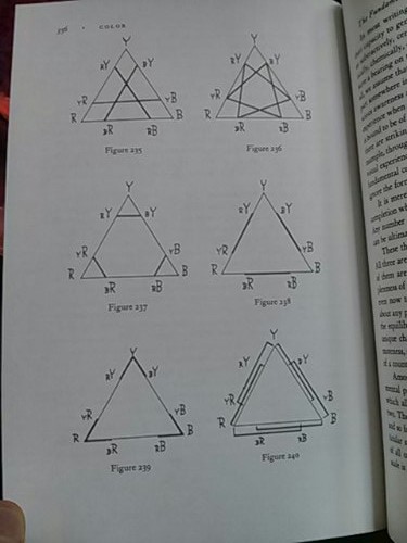
Arnheim, R. - Syntax of Colour Combinations

wpid-IMG_20140601_160509.jpg Fig.235 - Similarity of the subordinate Fig. 236 - Structural contradiction in one common element Fig. 237 - Similarity of the dominant Fig. 238 - Structural Inversion

categories: reference
Sunday 06.01.14
Posted by Zhenia Vasiliev
 

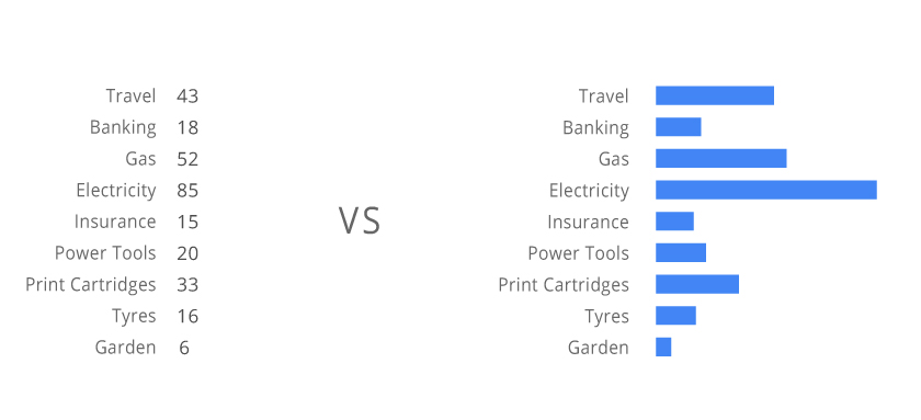
So why do infographics work, then?

nums_vs_graphics Logically, users are after numbers, because that where the core information is. Why is there a need to visualize the data?

It seems like there is a purely visual mechanism that helps us to understand data in a different way when we look at the image, as compared to just the display of numbers, - a new meaning appears.

tags: cognitive, composition, data visualization, design, infographics, psychology
categories: reference
Friday 05.30.14
Posted by Zhenia Vasiliev
 

What did Otto Neurath like to collect?

Austrian philosopher of science Otto Neurath was famous for his passion of collecting various curiosities. Here's some of the things he was interested in:

  • hieroglyphics
  • isotype (vienna method)
  • pictocharts/pictograms
  • phenakistoscope
  • atlas
  • pictorial mnemotechnique
  • emblem
  • symbol/inn signs
  • binary/duodenary systems
  • visual aid/visual education
  • saragon (voice)
  • synchronogical chart
  • tangram (dissection puzzle)
  • rebus cards
  • roundel
  • alphabet books
  • accident prevention pictures
  • optical teaching aids
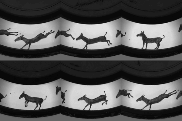
  • zoopraxiscope
  • drawings of primitive peoples and children
  • sachbilder (descriptive pictures)
  • anamorphic pictures
  • mayan pictures
  • cave paintings
  • silhouettes

zoopraxiscope
source: Neurath, O., From Hieroglyphics to Isotype: A Visual Autobiography, 2010 Image source: http://en.wikipedia.org/wiki/Zoopraxiscope

tags: research
categories: reference
Saturday 05.24.14
Posted by Zhenia Vasiliev
 

Development of art psychology: a rough mind map

psychology_of_art_mind_map

Source:http://en.wikipedia.org/wiki/Psychology_of_art

tags: art, phenomenology, philosophy, psychology
categories: reference
Saturday 05.03.14
Posted by Zhenia Vasiliev
 

Top 16 Stockholm icons

[gallery columns="4" ids="7216,7217,7218,7219,7220,7221,7222,7223,7224,7225,7226,7227,7228,7229,7230,7231"]

categories: photos, reference
Tuesday 04.22.14
Posted by Zhenia Vasiliev
 

Dangers of London

[gallery columns="4" ids="7209,7210,7211,7212,7213,7214"]

tags: design, icons, london
categories: photos, reference
Tuesday 04.22.14
Posted by Zhenia Vasiliev
 

John Ruskin, The Elements of Drawing - things to be studied

1. Always right: Titian, Veronese, Tintoret, Giorgione, John Bellini and Velasquez. 2. Questionable: Van Eyck, Holbein, Perugino, Francia, Angelico, Leonardo da Vinci, Corregio, Vandyck, Rembrandt, Reynolds, Gainsborough, Turner and the modern Pre-Raphaelites.

3. Most desirable: Samuel Prout (Rhine), John Lewis (sketches in Spain), George Cruikshank (Grimm's german Stories), Alfred Rethel (Dance of Death, Death the Avenger, Death the Friend), Bewick, Blake (Book of Job), Richter (illustrations to Lord's Prayer), Rosetti (edition of Tennyson).

tags: art, painting, research
categories: reference
Sunday 04.13.14
Posted by Zhenia Vasiliev
 

There's no such thing as Data Visualisation

Strictly speaking, there are only surfaces covered with marks. The rest is human interpretation of them. This could be argued that 'there are examples of graphics where shapes and colours are not employed to represent data'.

The answer to this might be:

'We agree that any conscious design activity implies some kind of analytical thinking. And where there's analysis, there's data. Therefore, any graphic design is dealing with representing data, and so there's no entity as Data Visualisation which would be separate from any other designing activity. And in turn, this proves that Data Visualisation is a term which was created artificially.'

I.e. we came up with term 'data visualisation' so that, on one side, we'd have a certain theoretical framework to facilitate working with what interests us most, and on another, to make sure  clients pay us more and with greater ease.

categories: reference
Wednesday 03.12.14
Posted by Zhenia Vasiliev
Comments: 1
 

Explanation of perspectives

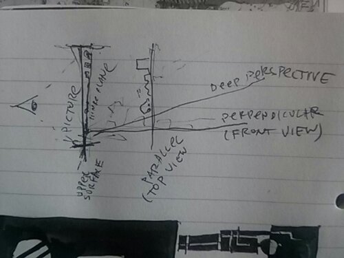
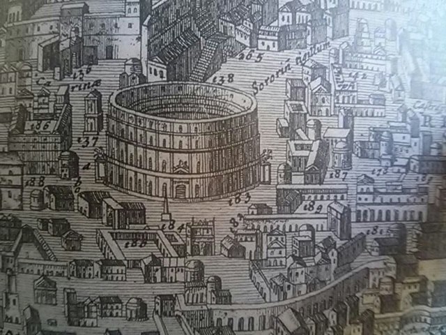
image Perspective, depending on the angle of picture plane to picture's surface. When two planes are parallel, it creates a top view (as in most maps). When perpendicular, it is a front view. Sharper angles create deep perspectives, flatter angles are less deep. wpid-wp-1392561971566.jpg(map of Rome from Otto Neurath, p.151)

categories: reference
Sunday 02.16.14
Posted by Zhenia Vasiliev
 

Rothaus!

rothaus

categories: photos, reference, research notes
Saturday 02.08.14
Posted by Zhenia Vasiliev
 
Newer / Older

Zhenia Vasiliev © 2025